LifeTrip - Travel App
This project showcases my proficiency in UI design using Figma, incorporating various design techniques to create an engaging and visually appealing travel app experience.
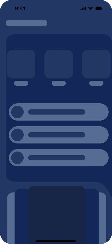
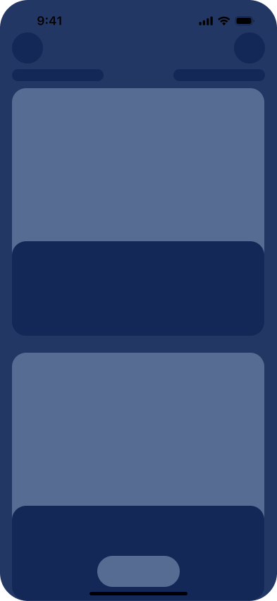
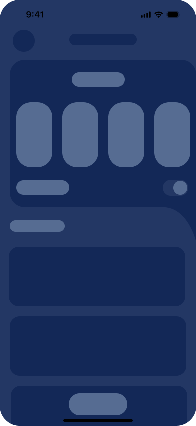
Wireframe Design
- Developed wireframe designs for the LifeTrip travel app, focusing on Stays Page, Search Rooms, and Search Flights sections.
- Ensured clarity and structure in user interface elements, navigation, and content placement.
- Defined the basic layout and functionality of each section.
Prototype
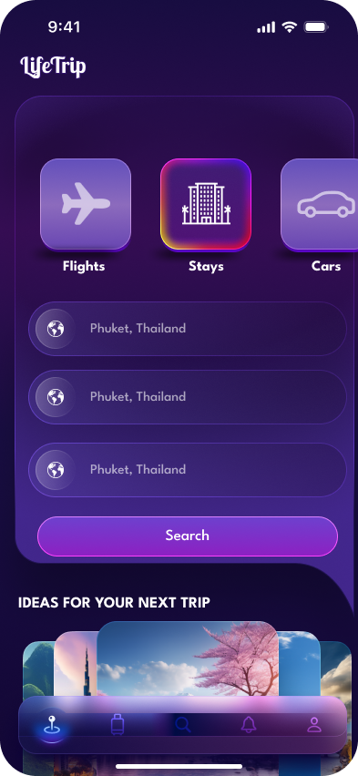
- Created interactive prototypes to provide a dynamic representation of the Stays Page, Search Rooms, and Search Flights sections.
- Integrated user flows and interactions to showcase the app's navigation and features.
- Gathered feedback on the prototype to refine the user experience.
Key Interfaces
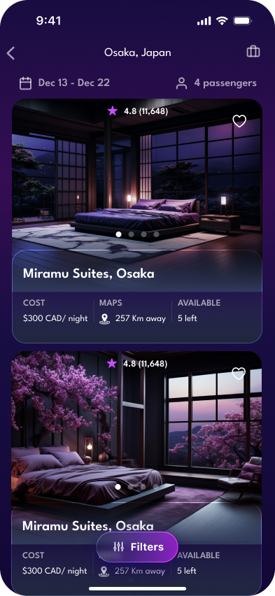
Stays Page
- Designed a visually appealing Stays Page with captivating images and clear details.
- Implemented Auto Layout to ensure a seamless transition between different screen sizes.
- Leveraged typography and symbols for consistent and easy-to-read information.
Search Rooms
- Created a user-friendly Search Rooms section with intuitive filters for a personalized search experience.
- Applied a cohesive color scheme and gradient effects to enhance the visual appeal.
- Incorporated symbols for consistent iconography throughout the search process.
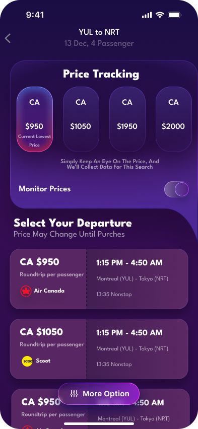
Search Flights
- Developed a streamlined Search Flights section with a focus on simplicity and efficiency.
- Implemented angular techniques for a modern and dynamic appearance.
- Used typography to convey essential flight details clearly.
UI Design Techniques
- Typography and Symbols
- Auto Layout
- Colors and Gradients
- Linear and Angular Techniques
- Neon Color Effect
Implemented consistent typography for a cohesive visual identity. Utilized symbols for repeated elements to ensure design consistency.
Employed Figma's Auto Layout feature for responsive and adaptive design, enhancing user experience across different devices.
Incorporated a harmonious color palette to evoke a travel-friendly atmosphere. Applied gradients to create depth and visual interest in UI elements.
Utilized linear design elements for a sleek and modern look. Incorporated angular techniques to add dynamism and contemporary aesthetics.
Introduced neon color effects to enhance the visual appeal and provide a vibrant and lively feel to the travel app.